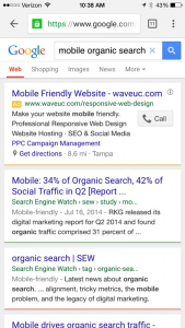
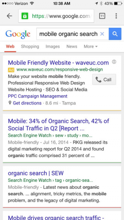
 On April 21, 2015 Google made changes to it’s algorithm that directly affected websites that were not properly configured for mobile devices, specifically smartphones. The benefit to mobile-friendly websites are that they could get a boost from Google in the mobile search engine results page. However, mobile sites that are not mobile-friendly will get hit hard by Google. This will have no affect on website rankings from a desktop – mobile only and Google is strictly referring to organic searches on a smartphone.
There has been a huge increase, for obvious reasons, by smartphone users conducting searches from their browser on mobile devices. eMarketer reports figures from StatCounter during Q4 2014 and found that 86% of US mobile search referrals (excluding tablets) during the final quarter of last year were on Google. The users are clearly there, now Google is trying to clean up the sites that are not mobile-friendly by penalizing them in the search results. What happens now?
There are two things you need to do right now
- Make sure your website is mobile-friendly. Go to Google’s Mobile-Friendly Test and enter your website address. Google will analyze the site and let you know in seconds if it is mobile-friendly. If you failed this test, it’s extremely important that you fix this issue ASAP. Do not pass GO, do not collect $200. Another way you can test this is to pull up your own website on a smartphone and see for yourself. Does all images and text fit nicely in the browser or do images and text look cattywampus?
- Do your own analysis of organic mobile traffic to your website via Google Analytics. It’s not only important to see how much mobile traffic is currently coming to your website, but it’s also important to identify how much organic mobile traffic has occurred over the past quarter, 6-months and year.
To be clear, the algorithm change only affects mobile search results and does not affect searches conducted on a desktop. However, with the exponential increase in organic search on a smartphone, it’s best that you jump on the bandwagon ASAP.
eMarketer estimates that there will be 157.3 million US mobile phone search users in 2015—or 61.0% of mobile phone users and 49.0% of the population. By 2019, nearly two-thirds of consumers—or 215.8 million people and 78.8% of mobile phone users—will conduct a search via mobile browser or app at least monthly.
Google provided a list of seven common mistakes to avoid for your mobile site:
- Blocked JavaScript, CSS and image files
Blocking files are files that a website visitor has to load before your web page will display. The easiest way to fix these types of files is to move all JavaScript to the bottom of the page right before the closing body tag. All CSS and JavaScript files should be minified and all images should be compressed. For more information, check out 3 things you can do right now to help your website.
2. Unplayable content
Stop using Flash. Seriously, stop, it’s dead. You need to make sure all content works on mobile devices, especially videos. It may be time to consider HTML5 if you haven’t already made the conversion.
3. Faulty redirects
Redirects can be great. If a page no longer exists, I’d rather be redirected to the replacement page then see a nasty 404 Page Not Found error. But there’s no faster way to lose a visitor than sending them to a place they’re not interested in. If your redirects sending visitors to general information pages, you’re doing it wrong. If you detect a mobile browser and redirect the user’s browser to mobile.yourdomain.com (or something similar) without including the appropriate path, you’re doing it wrong. Fix your redirects and convert your site to use a responsive design!
4. Mobile-only 404s
If you’re only showing certain pages to your desktop visitors and hiding them from mobile visitors, you really are misunderstanding what the mobile revolution is about. Any page you can view on your desktop browser should be accessible to a tablet or phone. This is another area a good responsive design can help remedy.
5. App download interstitials
Remember the days of installing pop-up blockers so you didn’t have to deal with websites loading all kinds of pop-ups? It was annoying. App download interstitials are no different. In fact, they may be worse. A mobile screen is small enough, commandeering it to tell me about your app is just aggravating. A simple banner is enough to notify the user. Remember, it’s about crafting a good user experience, and for some visitors, that may not include downloading your app.
6. Irrelevant cross-links
Again, a responsive design can really help with this. Cross-linking between the “desktop” version and “mobile” version is going to cause nothing but problems. If you have to do this, make sure you’re linking to the proper versions. But seriously….go responsive.
7. Slow mobile pages
Remember the days of dial up modems? Probably not if you’re under 20. It was awful, sometimes you had to wait as much as 30 to 40 seconds for a web page to load. Then the Internet got faster and you know what changed? We’re less patient! Seriously, if a web page takes more than 3 seconds to load, web analytics data shows visitors are bailing on the site. That’s no different with mobile. Many 4G and LTE speeds still don’t come close to fiber optics, so those large images that look great on your desktop? Not so much fun to load on mobile. Compress your images, minify your CSS and JavaScript.
How do you think this new algorithm change will affect organic search mobile traffic? Let’s us know in the comments below.
Additional recommended articles you may enjoy:

